
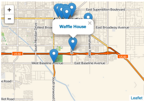
All code for this post is open source and is available on github. I was recently introduced to leaflet.js, a javascript map library that is very easy to use.
The business data looks like this:
{
    'type': 'business',
    'business_id': (encrypted business id),
    'name': (business name),
    'neighborhoods': [(hood names)],
    'full_address': (localized address),
    'city': (city),
    'state': (state),
    'latitude': latitude,
    'longitude': longitude,
    'stars': (star rating, rounded to half-stars),
    'review_count': review count,
    'categories': [(localized category names)]
    'open': True / False (corresponds to closed, not business hours),
}location_comparisons = JOIN locations BY category, locations_2 BY category USING 'replicated';
distances = FOREACH location_comparisons GENERATE flat_locations::business_id AS business_id_1,
locations_2::business_id AS business_id_2,
flat_locations::category AS category,
udfs.haversine(flat_locations::longitude,
flat_locations::latitude,
locations_2::longitude,
locations_2::latitude) AS distance;@outputSchema("distance:double")
def haversine(lon1, lat1, lon2, lat2):
"""
Calculate the great circle distance between two points
on the earth (specified in decimal degrees)
"""
# convert decimal degrees to radians
lon1, lat1, lon2, lat2 = map(radians, [lon1, lat1, lon2, lat2])
# haversine formula
dlon = lon2 - lon1
dlat = lat2 - lat1
a = sin(dlat/2)**2 + cos(lat1) * cos(lat2) * sin(dlon/2)**2
c = 2 * asin(sqrt(a))
km = 6367 * c
return kmnearest_businesses = FOREACH (GROUP with_coords BY business_1) {
sorted = ORDER with_coords BY distance;
top_10 = LIMIT sorted 10;
GENERATE group AS business_id,
(float)(2.0 * MAX(top_10.distance)) AS range:float,
top_10.(business_2, name, latitude, longitude) AS nearest_businesses;
}
STORE nearest_businesses INTO 'mongodb://localhost/yelp.nearest_businesses' USING MongoStorage();def map_degree_to_zoom(degree_value):
# Determined by experimentation with Leaflet UI and MAX() of distances in Pig
range_min = 0
range_max = 142
zoom_min = 7
zoom_max = 12
# Compute ranges
range_span = range_max - range_min
zoom_span = zoom_max - zoom_min
# Convert the left range into a 0-1 range (float)
value_scaled = float(degree_value - range_min) / float(range_span)
# Convert the 0-1 range into a value in the right range.
return int(zoom_max - (value_scaled * zoom_span))| 1.26710856 | 15 |
| 0.418455511 | 16 |
| 4.176179886 | 13 |
| 4.059176445 | 13 |
| 2.985990286 | 13 |
| 4.584879398 | 13 |
| 0.341496378 | 16 |
| 0.633716404 | 16 |
| 3.525056601 | 13 |
| 4.084414959 | 13 |
| 0.713507891 | 15 |
| 15.74468708 | 11 |
| 6.349864006 | 12 |
| 5.078705788 | 12 |
| 6.349864006 | 12 |
| 9.700486183 | 12 |
| 25.13388824 | 11 |
| 13.71557617 | 11 |
| 0.065407977 | 18 |
| 11.24457836 | 11 |
| 12.29977512 | 11 |
| 20.05439949 | 11 |
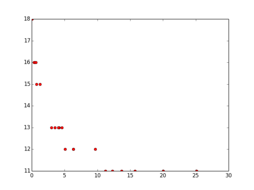 The data correlation is strongly negative:
from scipy import stats
import matplotlib.pyplot as plt
import numpy as np
from scipy.optimize import curve_fit
from math import log
# Build X/Y arrays from file 1
f = open('yelp_zoom_2.csv')
lines = f.readlines()
x = []
y = []
for line in lines:
    line = line.replace("\n", "")
    vals = line.split(",")
    x.append(float(vals[0]))
    y.append(float(vals[1]))
x = np.array(x)
y = np.array(y)

plt.plot(x, y, 'ro',label="Original Data")
np.corrcoef(x,y) #-0.78def func(x, a, b):
y = a*(-np.log(x)) + b
return y
popt, pcov = curve_fit(func, x, y)
print "a = %s , b = %s" % (popt[0], popt[1])
# Trying to plot without using linspace will result in a chaotic, pissy plot that will confuse you.
# numpy.linspace simply creates a series of evenly spaced X values to plot a continiuous function.
test_x = np.linspace(0,30,50)
plt.plot(test_x, func(test_x, *popt), label="Fitted Curve")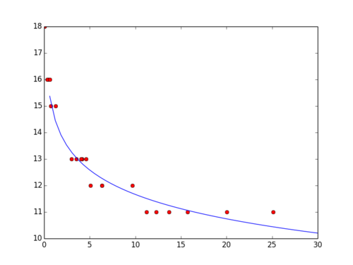 The benefit of doing this regression in Python and not Excel, is that I can now include the prediction in my web application like so:
# Apply result of regression
def map_km_to_zoom(km, a, b):
    y = a*(-np.log(km)) + b
    return y

# Controller: Fetch a business and display it
@app.route("/business/")
def business(business_id):
    business = businesses.find_one({'business_id': business_id})
    nearby = nearest_businesses.find_one({'business_id': business_id})
    zoom_level = map_km_to_zoom(nearby['range'], 1.32809669067, 14.7211913904)
    return render_template('partials/business.html', business=business, zoom_level=zoom_level)