
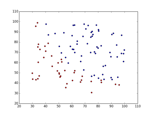
Below we do this using Numpy masks to create a negative/positive index against the y variable, which represents acceptance (0/1). Then we apply that mask to the x1/x2 variables, and issue two plot commands - one for negative, one for positive.
And voila!
# Build X, Y from file
f = open('ex2data1.txt')
lines = f.readlines()
x1 = []
x2 = []
y = []
for line in lines:
    line = line.replace("\n", "")
    vals = line.split(",")
    x1.append(float(vals[0]))
    x2.append(float(vals[1]))
    y.append(int(vals[2]))


# Build numpy arrays
x1 = np.array(x1)
x2 = np.array(x2)
y = np.array(y)


# Build positive/negative masks from Y
pos_mask = (y == 1)
neg_mask = (y == 0)


# Apply masks to X
positive_x1 = x1[pos_mask]
negative_x1 = x1[neg_mask]
positive_x2 = x2[pos_mask]
negative_x2 = x2[neg_mask]


# Scatter plot results in two colors
pl.scatter(positive_x1, positive_x2, c='b')
pl.scatter(negative_x1, negative_x2, c='r')